For over two years now I have been in a not so secret war with #99140A. This color has a strong overwhelming presence in every medium of communication coming out from the company I work for. One of my main tasks at work is to be sure that every B2B design component is a well-balanced composition with a clear message.
Before redesigning the company’s B2B components and erasing any evidence of #99140A’s existence, it was important to know why this color had such a strong presence. I gasped and choked every time I discover yet another communication or marketing piece suffocated with #99140A. The designer in me understood that there was more to the color that meets the eye.
History
Color is part of the visual narrative we use to tell our personal, social, and geographic history. Colors contain lots of symbolism; think for example of country flags, teams uniforms, and the accent wall in your house.
Wine and Northern California have been in a committed relationship since 1821, when the Russian colonists planted the first grape vine in the region. By 1989, Northern California, and Sonoma County especially, experienced a wine boom with grapes being the first source of revenue for the region*. After a closer look at wine industry related companies, it was evident that #99140A was a clear component of their identity.
Sonoma County Business logos with #99140A
Symbolism
#99140A, is not just a color for the businesses in the Sonoma region, it is a statement that declares its relationship with wine. It is also called the wine color or the vino color. This color tells the history of “refined taste” and how a company has a place in the region’s $11 billion dollar wine industry of today.
Change is Inevitable
It was obvious that the company was working with 80’s style guides for communications. From presentations, B2B advertisement, media kits, and identity branding. Moreover, the economic and social realities of 2018 and today are very different from the ones in 1989.
Although the local economy is still very reliant on the wine industry, the Sonoma region has diversified over the last 20 years. Yes, we are still drinking, but not only wine. We have award-winning craft brewers, organic growing crops, health care companies, and a year-long flow of tourism.
Old Product Presentation
Old Product Slide Presentation
Old Sonoma Magazine Media Kit
Old Summer Guide
Old Product Slide Presentation
Old Latino Life media kit
Old Summer Guide
Old Product Presentation
Old Sonoma Magazine Media Kit
Resistance vs Do the Homework
Why doesn’t change come without resistance?
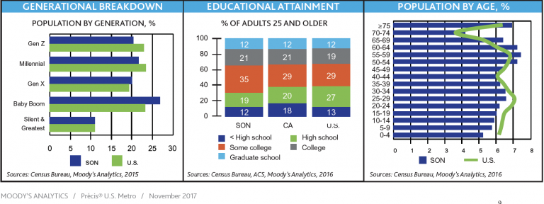
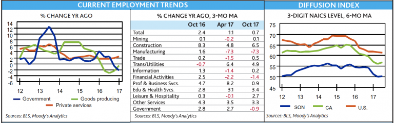
After more of a decade using the same color and style guide it was difficult for a lot of people in the company to embrace change. Therefore, I used 2018 data from the Winter Local Economic Forecast Report by The Economic Development Board of Sonoma County to find the economic projections for the local economy. The report confirmed the region’s diversity and constant change, justifying the urgent need to upgrade the way the company presents itself and communicates with the world.
Sonoma County Winter 2018 Local Economic Report By The Economic Development Board
Bad Words & Good words
Designers are idea sellers. We make visual interpretations of data, information, and ideas, but the terms we use are as important as the colors and fonts we select. It is better to innovate rather than conform when attempting to change minds and widen perspectives. Keep people looking forward to improvements, instead of remarking the old.
Consumer Based Design
I found out that a lot of the B2B communications had images depicting white women drinking wine or women in the kitchen with very suspicious overly joyous smiles (what is inside the oven?). The images used previously did not represent the ethnic diversity and changing demographics for the region. Businesses want to attract consumers with buying power and consumers come in all sizes, races, orientations, and social statuses.
Working for B2B implies a broad thinking, concentrating on the other business while also having to factor in their consumers.
The region has a lot of diversity in business ownerships. A surge of startup has coincided with millennials becoming the heads of households and business managers. Although it was possible to concentrate in a specific consumer group, the population data was not specific enough to justify any specific distinction.
Appealing to a wider group of consumers and visually representing the region’s demographics is always a good start point for any business existing within a diverse population.
Defining Layouts
The industry I work for is a well-known news media company. Its primary products are advertisement, events, and special editions.
The industry has 2 types of consumers: print readers and online readers.
Q4s are a group of print and online advertisement packets called media kits that promote the company’s advertisement products.
To better define layouts there were 3 main components to consider: images, data, and product descriptions